纯CSS3实现哆啦A梦
- 2015-10-07 15:31:38
- 幻音い
- 15791
温馨提示: 这篇文章于3934天前编写,现在可能不再适用或落后.
我曾经在绿叶论坛发表过一篇哆啦A梦原文章,但是没有说过程只是简单的发了一下压缩包。
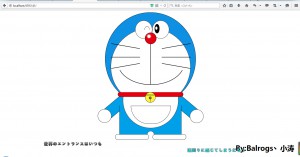
此哆啦A梦采用了CSS3技术的border-radius属性(圆边角)+简单的定位属性即可实现上图
准备材料:
支持CSS3属性的浏览器即可,html编辑器任意。
如果大家还不熟悉css3的border-radius属性的话可以去绿叶学习网border-radius这里学习一下。
废话不多说,打开你们各自的浏览器吧....
首先是html的结构,呃....都全部用div就可以了,大家可以看一下我下面的结构。html结构我就不多说了,这个不懂的可以在下面评论,我看见会回复的~
    <div class="container">
        <div class="header">
            <div class="header_border">
                <div class="yan_l">
                    <div class="yunxian">
                        <div class="clear_one"></div>
                    </div>
                </div>
                <div class="yan_r">
                    <div class="yanqiu">
                        <div class="yanzhu"></div>
                    </div>
                </div>
                <div class="bizi">
                    <div class="bizi_qiu"></div>
                </div>
                <div class="header_x">
                </div>
                <div class="zuiba"></div>
                <div class="x1"></div>
                <div class="x2"></div>
                <div class="x3"></div>
                <div class="x4"></div>
                <div class="x5"></div>
                <div class="x6"></div>
                <div class="clear_two"></div>
            </div>
        </div>
        <div class="body">
            <div class="weijing">
                <div class="lingdang">
                    <div class="zhongxian"></div>
                    <div class="lingdang_qiu"></div>
                    <div class="lingdang_xian"></div>
                </div>
            </div>
            <div class="shengti">
                <div class="koudai">
                    <div class="koudai_c"></div>
                </div>
                <div class="jiao_l"></div>
                <div class="jiaowan"></div>
                <div class="jiao_r"></div>
            </div>
            <div class="shou_l">
                <div class="shou_l_qiu"></div>
            </div>
            <div class="shou_r">
                <div class="shou_r_qiu"></div>
            </div>
        </div>
    </div>
呃呃...那个..类名称由于英语渣,你们懂的..
接下来就到了我们写CSS的时候了
首先初始化一些属性
/*初始化*/
*{
margin:0;
padding:0;
outline: none;
}
img{
border:0;
}
a{
text-decoration:none
}
ul li{
list-style:none;
}
接下来我们要“画”它的头对了,大家使用定位的时候要注意定位的思想,“外相对内绝对”。
然后接下来根据头的里面蓝色的那啥确定位置
使用定位居中让中间的白色脸居中
/*整体=包裹哆啦A梦的DIV*/
.container{
margin:10px auto; /*居中*/
width:500px;
height:600px;
overflow:hidden; /*不让它跑出去*/
position:relative;
}
/*多啦A梦的头*/
.header{
border:1px solid black;
width:410px;
height:420px;
margin:0px auto;
border-radius:50%;
position:relative;
overflow:hidden;
background-color:rgb(16, 144 ,227);
}
.header_border{
border:1px solid black;
width:360px;
height:350px;
border-radius:50%;
position:relative;
top:70px;
left:50%; /*左移动一半*/
margin-left:-180px;/*在使用margin-left取width的360/2的像素 就可以居中了*/
background:#fff;
}
“画”完脸后,就需要“画”眼睛了眼睛的左眼的线,本来我是想直接一个border-radius搞定的,但是感觉不好看所以多加了一个div挡住了下面多余的部分
之后我全部放出css内容 注释将会写出这是什么位置
/*眼睛*/
.yan_l,
.yan_r{
position: absolute;/*这里就是使用到了 外相对内绝对,大家可以试一试*/
border:1px solid black;
width:75px;
height:80px;
border-radius:50%;
top:-35px;
background:#fff;
overflow:hidden;
}
.yan_l{
left:110px;
}
.yan_r{
left:187px;
}
/*左眼线*/
.yunxian{
border:1px solid black;
border-radius:50%;
width:23px;
height:40px;
position:relative;
top:25px;
left:40px;
}
.clear_one{/*多加一个DIV挡住眼睛下半部分,就形成了一个凸出来的半圈*/
position:absolute;
top:15px;
left:-4px;
width:30px;
height:28px;
background:#fff;
}
/*右眼球*/
.yanqiu{
width:20px;
height:40px;
border:1px solid black;
border-radius: 50%;
background:black;
position:relative;
top:15px;
left:10px;
}
.yanzhu{
background:#fff;
width:10px;
height:15px;
border-radius:50%;
position:absolute;
top:10px;
left:2px;
}

/*鼻子*/
.bizi{
border:1px solid black;
width:50px;
height:50px;
margin:0px auto;
position:relative;
top:20px;
border-radius:50%;
background: rgb(229, 0, 17);
z-index:20;
}
.bizi_qiu{
background:#fff;
width:15px;
height:15px;
border-radius:50%;
position:absolute;
top:8px;
left:10px;
box-shadow:0px 0px 5px #fff;
}

/*胡须*/
.x1,.x2,.x3,.x4,.x5,.x6{
    position:absolute;
    border:1px solid black;
    z-index:10;
    width:130px;
}
.x1,.x2,.x3{
    left:0px;
}
.x4,.x5,.x6{
    left:230px;
}
.x1{
    top:80px;
    transform:rotate(10deg);
}
.x2{
    top:130px;
}
.x3{
    top:170px;
    transform:rotate(170deg);
}
.x4{
    top:80px;
    transform:rotate(170deg);
}
.x5{
    top:130px;

}
.x6{
    top:170px;
    transform:rotate(10deg);
}</pre>
/*鼻子下面的线*/
.header_x{
background:black;
height:202px;
width:2px;
margin:0px auto;
position:relative;
z-index: 10;
}
/*嘴巴*/
.zuiba{
border:2px solid black;
width:300px;
position:relative;
top:-200px;
left:50%;
margin-left:-150px;
border-radius:50%;
height:199px;
z-index:0;
}
.clear_two{/*同样挡住此处半圆,此处的遮挡范围比较大,小心点*/
width:320px;
height:140px;
position:absolute;
top:50px;
left:50%;
margin-left:-160px;
background:#fff;
z-index: 5;
border-top-left-radius:50%;
border-top-right-radius:50%;
}
/*头部完成*/


/*身体*/
.body{
position:relative;
width:500px;
height:500px;
margin:-60px auto 0;
background:#fff;
overflow:hidden;
}
/*围巾*/
.weijing{
border:1px solid black;
background: rgb(229, 0, 17);
width:295px;
height:20px;
position:relative;
left:50%;
top:-1px;
border-radius:15px;
margin-left:-147.5555px;
z-index:25;
}
.lingdang{
border:1px solid black;
width:45px;
height:45px;
border-radius:50%;
position:relative;
left:50%;
margin-left:-25px;
background-color:rgb(254 ,244 ,57);
}
.zhongxian{
border:1px solid black;
height:3px;
width:85%;
left:50%;
margin-left:-47.5%;
border-radius:20px;
position:absolute;
top:10px;

}
.lingdang_qiu{
border:1px solid black;
width:10px;
height:10px;
border-radius:50%;
background-color:rgb(127 ,109, 91);
margin:19px auto 0;

}
.lingdang_xian{
width:1px;
background:black;
height:15px;
margin:0px auto;
}
.shengti{
border-left:1px solid black;
border-right:1px solid black;
width:280px;
height:130px;
margin:-1px auto 0px;
position:relative;
top:40px;
z-index: 5;/*多注意z-index的层叠关系 因为这个很重要*/
background:rgb(0, 160 ,232);
}

/*手*/
.shou_l{
border-top:1px solid black;
border-bottom:1px solid black;
position:absolute;
top:40px;
left:38px;
width:110px;
height:50px;
transform: rotate(140deg); /*旋转140度,根据不同方向旋转*/
z-index: 2;
background:rgb(0, 160 ,232);
}
.shou_l_qiu{
border:1px solid black;
width:60px;
height:60px;
border-radius:50%;
position:absolute;
left:90px;
top:-5px;
background:#fff;
}
.shou_r{
border-top:1px solid black;
border-bottom:1px solid black;
position:absolute;
top:40px;
left:355px;
width:110px;
height:50px;
transform: rotate(40deg); /*旋转40度,根据不同方向旋转*/
z-index: 2;
background:rgb(0, 160 ,232);
}
.shou_r_qiu{
border:1px solid black;
width:60px;
height:60px;
border-radius:50%;
position:absolute;
left:90px;
top:-5px;
background:#fff;
}

/*四次元口袋*/
.koudai{
border:1px solid black;
width:250px;
height:250px;
position:relative;
left:50%;
margin-left:-125px;
border-radius:50%;
top:-150px;
z-index: 20;
background:#fff;
}
.koudai_c{
border:1px solid black;
position:absolute;
top:150px;
margin-left:-90px;
left:50%;
width:180px;
height:80px;
border-radius:0 0 180px 180px;
}
/*因为口袋是上面封顶 所以直接不用遮挡 还是同样的外相对内绝对*/
最后!就是他的脚咯,脚使用border-radius就可以实现,然后固定其位置,一定要扁一定要扁一定要扁,重要的事说三遍。然后脚的中间再搭上一座“桥”←_←一样不同遮挡
然后大功告成的哆啦A梦就完工了,如果想要跟真实一点可以使用box-shadow属性添加阴影
最后的最后,肯定放源代码呀~
源码地址:https://pan.baidu.com/s/1fULlk 密码:em9v
曾经的原帖地址:点我进入
上一篇
没有上一篇文章啦~
随便看看
阁下需要登录后才可以查看评论哦~